
Are you a fellow Heart Explorer?
My Moondancing Weekly Soul Letter is for truth-seekers who follow their own inner compass … and want to feel a bit less alone along the way.
Tell me more
 |
 |
 |
|
|
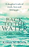
A daughter's tale of truth, love and letting go |
|
 |
|
|
An addictive spin on awakening, soulmates and past lives |
|
Awards | Free chapters | Buy |
|
Little-known Moondance facts
Here are some fun Moondance facts and stories about its creation.
- Where did the name Moondance come from?
- Is the cover image a crop circle?
- How did you create the cover? (it was quite the ordeal)
Where did the name Moondance come from?
The first title I ever had for Moondance was Versuchung, which means “Temptation” in German, and the same name of a breathtaking etching I own by Jurgen Gorg. This piece of art inspired the green-eyed man scene on page 271, the first line I ever wrote!
A few years later, I got serious and changed the title to Ricochet, though I thought of it as a working title.
In 2003, I took a karaoke workshop to face my fear of singing in public. The song I sang over and over, for three days, was Moondance, by Van Morrison, and months later, it hit me — Moondance was the perfect name for my book.
In astrology, the moon represents the emotions. The dance part... well, you'll have to read the book to find out.
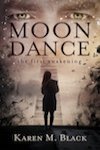
Is the (first edition) cover image a crop circle?
It's adapted from a crop circle web site I stumbled into. It's based on a Scorpio crop circle that really exists. I love it because Moondance is thematically Scorpio, and because it ties in the circles metaphor I use throughout the book.
How did you create the original cover?
Covers are so important, and in the sea of competition, I am an unknown, so I knew I had to create a cover that stood out. I also personally love good design.
The cover took almost five months — almost as much time as writing the entire book! Just kidding. But it wasn't a linear process (and neither was the writing of Moondance).
First, I worked with designer Angel Guerra from Archetype Design in Toronto. I looked at literally hundreds of images on my own on Corbis. Angel also took some gorgeous, treated photographs for me to consider.
I decided to use Angel's photograph on my cover. We began to explore layouts, more than a dozen. Then I started on font research.
The font
First, I rejected any font that looked too traditional, or on the other hand, too grungy. After considering literally dozens of fonts, I finally chose Optima, which I found elegant, clean and unique for a book cover. Angel laid it out in a number of ways over the photograph I had chosen.
The Scorpion image
I thought we were set. Then I had a conversation with a designer friend Vinita and though she loved the photo, she felt the cover was flat, and it wouldn't stand out. When she said this, my heart sank. But deep down, I knew she was right.
After taking a deep breath, I decided to search for a scorpion image which would work with the photograph because Moondance is thematically based on the astrological sign Scorpio.
A few days later, I sent my top scorpion choices to Angel and he re-laid the cover out, but for me, something was missing (and I'm sure Angel was wondering about my sanity). I felt discouraged.
Later, I was visiting my family, and I explained the situation to my sister. She did a net search, and we found a really cool scorpion image on a crop circle web site of all places. The image immediately felt right to me.
It was clean, graphically striking, and to boot, it was made up of circles, which is a metaphor I use repeatedly in the book. I also loved the tie-in with crop circles, as the book asks the same type of questions. So Vinita used the crop circle to create the final Illustrator image for my cover, and I passed my new “brilliant” concept to Angel to layout (yet again).
How it all came together
That day, I got three e-mails from Angel in about five minutes as I sat at my computer. The first laid the image out with the photograph and declared (rightly so) that now I had a bizarre and really ugly cover. I felt like laying down and giving up.
Then he e-mailed to say he was looking for the silver lining. His final e-mail that day came a minute later, with an attachment — a new cover in which he had dropped the photograph I had chosen out completely, leaving the black background with the scorpion in red. When I saw it, I caught my breath and knew we were onto something. Red and black are both Scorpio colors.
Things were finalized quickly after that. We embossed the scorpion to add texture, an idea I loved because Moondance is a sensuous book.
Thanks for reading my little known Moondance facts
Take me to:
About Moondance – Awards, premise, plot summary and more
Buy Moondance now – Paperback and Kindle versions...